

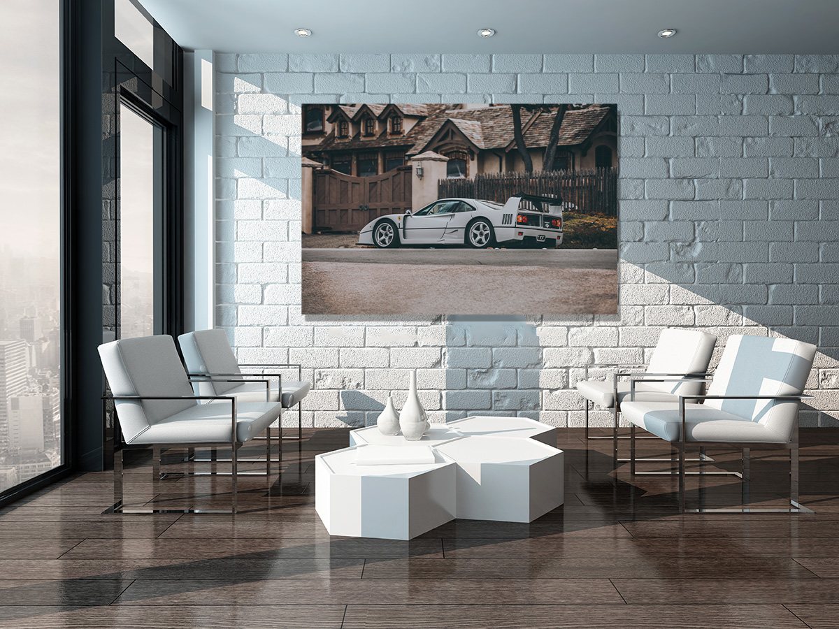
A minimalist room has nowhere to hide. Every object left on a bare wall or an open shelf has to earn its place — which is exactly why fine art automotive photography works so well there. One striking print, given the right amount of empty space around it, can carry an entire minimalist room the way a whole gallery wall might in a busier interior.
Table of Contents
- Why Minimalist Rooms Need a Statement Print, Not Decoration
- Black & White or Color: Choosing the Right Print for a Minimalist Space
- Aluminium or Canvas: Which Finish Suits Minimalism Best
- Size and Placement: One Bold Piece vs a Considered Pair
- Negative Space: The Real Secret of Minimalist Wall Art
Why Minimalist Rooms Need a Statement Print, Not Decoration
Minimalism isn’t the absence of decoration — it’s the absence of clutter. A minimalist living room, office or bedroom is usually built around a few carefully chosen materials (wood, stone, matte metal), a restrained color palette, and a lot of negative space. Into that kind of room, a busy gallery wall or a mismatched collection of frames reads as noise. A single, well-composed fine art print reads as intention.
That’s what makes automotive fine art photography such a natural fit for minimalist interiors: a classic car shot with a clean background, strong lines and controlled light already behaves like a minimalist composition before it even reaches your wall.
Black & White or Color: Choosing the Right Print for a Minimalist Space
Black and white photography is the safest starting point in a minimalist room, and for good reason: it removes one more variable from an already restrained palette, letting the shape of the car and the composition of the shot do all the work. A black and white print of a classic silhouette sits comfortably against almost any wall color, from warm white to charcoal grey.
Color isn’t off-limits, though. A single saturated tone — a red Ferrari, a yellow Porsche — can work beautifully as the one deliberate accent color in an otherwise neutral room, as long as it’s the only strong color present. The rule in a minimalist space isn’t “no color,” it’s “one color, used on purpose.”
Aluminium or Canvas: Which Finish Suits Minimalism Best
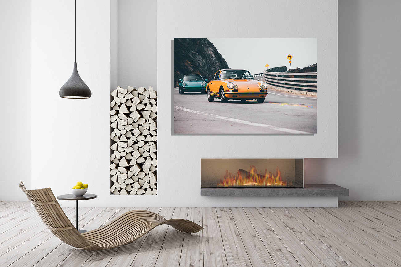
The finish matters as much as the image in a minimalist room, because texture is one of the few things minimalist interiors have plenty of room to show off. Aluminium (Dibond) prints have a smooth, almost architectural surface with a slight sheen — a natural match for modern, hard-edged minimalist spaces with concrete, glass or matte black fixtures.
Canvas brings a softer, matte texture that suits a warmer, Scandinavian-leaning take on minimalism — think light wood, linen and neutral upholstery. Plexiglas sits between the two: it adds depth and a gallery-like shine without the industrial coolness of raw aluminium. None of the three is objectively “more minimalist” than the others; it’s about matching the finish to the materials already in the room. (See our full guide to caring for aluminium, plexiglas and canvas prints for more on how each one behaves over time.)
Size and Placement: One Bold Piece vs a Considered Pair
Minimalist interiors tend to favor scale over quantity. A single large-format print — sized to feel intentional rather than merely large — almost always outperforms several smaller prints scattered across the same wall. If a room is going to have exactly one piece of wall art, this is the spot to be generous with the size.
That said, a considered pair can work in a minimalist space too, provided the two prints share a clear visual logic — the same car photographed from two angles, or two shots with matching horizon lines and color treatment. What doesn’t work is a loose cluster of unrelated pieces; that’s a gallery wall look, and it belongs in a different kind of room. (Our gallery wall guide covers that approach in detail, if that’s more your style.)
Negative Space: The Real Secret of Minimalist Wall Art
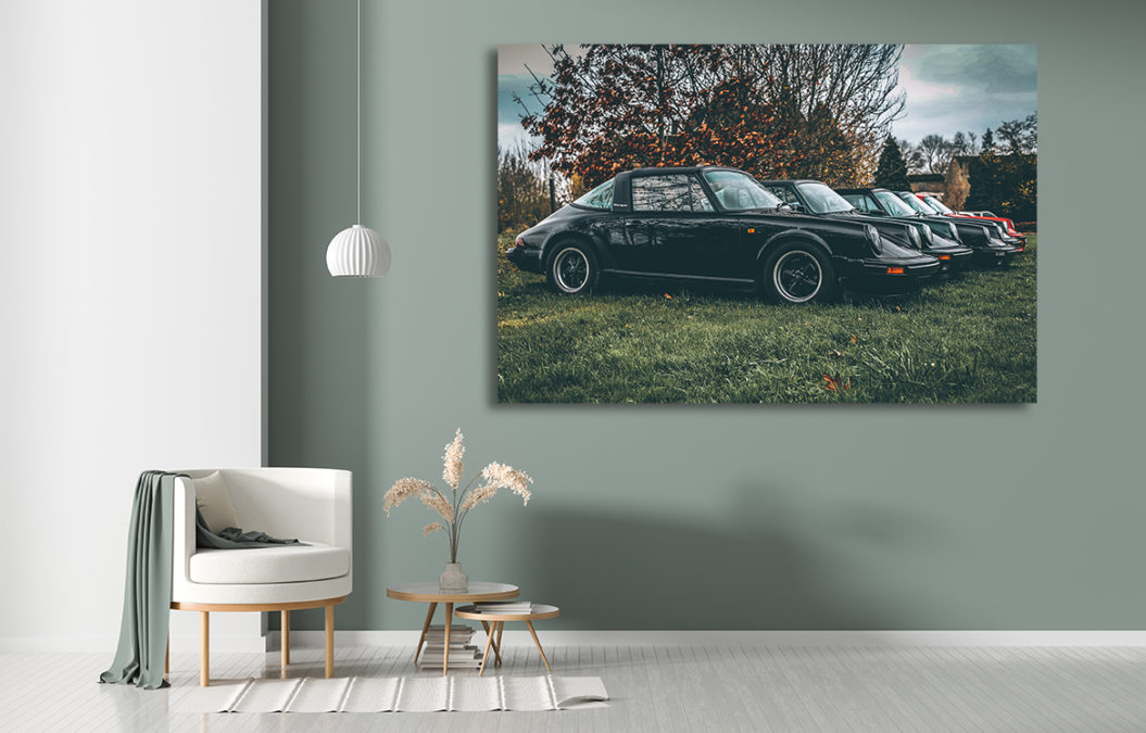
The single biggest mistake in minimalist decor isn’t choosing the wrong print — it’s under-sizing the empty wall around it. A print that’s technically the right size can still look cramped if it’s crowded by furniture, shelving or other art. As a rough rule, leave at least as much bare wall around the piece as the piece itself takes up; more, if the room allows it.
That breathing room is doing real work: it’s what turns a print from “something hung on the wall” into a genuine focal point, and it’s the detail that separates a minimalist room that feels deliberate from one that simply feels empty.
Frequently Asked Questions
Should a print in a minimalist room be black and white or color?
Black and white is the safer, more universally minimalist choice, since it removes one variable from the room’s palette. Color works too, as long as it’s a single deliberate accent tone rather than one of several competing colors.
What size print works best in a minimalist space?
Go larger rather than smaller. Minimalist rooms tend to have one statement piece rather than several small ones, so a single generously sized print, with enough bare wall left around it, almost always reads better than a scattered arrangement.
Aluminium or canvas for a minimalist interior?
Both work — it depends on the rest of the room. Aluminium’s smooth, slightly glossy surface suits a colder, more architectural minimalism (concrete, glass, matte black), while canvas’s soft matte texture fits a warmer, Scandinavian-leaning minimalism built around light wood and linen.
Is it better to have one large print or a small grouping?
In a genuinely minimalist room, one large print almost always works better than a grouping. A pair can work if the two images share a clear visual link, but a loose cluster of unrelated pieces reads as a gallery wall, which follows different rules entirely.
Also Read
- How to Create a Fine Art Gallery Wall: The Complete Guide
- How to Choose the Right Size for Your Photo Print: The Practical Guide
- How to Care for Your Fine Art Print: Aluminium, Plexiglas & Canvas Explained
- The Art of Car Interiors: Steering Wheels, Dashboards & Cockpits as Fine Art
- Nordic Landscapes: Iceland’s Waterfalls, Glaciers & Fjords as Fine Art