

To match a car print to your interior, start with the room, not the car. First, look at the dominant colours, the materials and the light. Then choose a photograph whose mood agrees with them. This guide covers four common palettes: neutral, dark, Japandi and industrial. For each one, it names real prints from our catalogue.
Why palette comes first when you match a car print to your interior
A car print is a large block of colour on your wall. Therefore, it changes the mood of a room more than a small object does. A bright orange car in a pale, quiet room can feel loud. In contrast, a heavy black image can feel too serious in a room full of colour.
The goal is not to copy the room. Instead, aim for a conversation between the print and what surrounds it. One shared colour, one shared mood or one shared material is usually enough. For a wider view of wall styles, our guide to modern wall décor ideas shows how this works in practice.
Match a car print to your interior: neutral rooms
Neutral rooms use white, cream, beige and grey. They are easy to live with, yet they can feel flat. A black and white photograph adds contrast without adding a new colour. Consequently, it is the safest choice for this palette.
The black and white Ford GT40 print is a good example. It stays calm, and it brings strong graphic lines to a pale wall. In addition, monochrome never fights with your cushions, your rug or your furniture. If you want to go deeper, read our guide to black and white photography decor.
Match a car print to your interior: dark rooms
Dark rooms use charcoal, navy, deep green or black. Many people think a dark wall needs a dark picture. However, a very dark print on a dark wall can disappear. Aim for tonal depth and a clear focal point instead.
Porsche GT3 RS – Wet Runway shows an orange GT3 RS on the wet tarmac of a private airfield, beside a light aircraft under an overcast sky. The grey light and the single warm accent suit a dark room well. Moreover, black and white images keep their strength on deep colours, so the GT40 print works here too.
Match a car print to your interior: Japandi spaces
Japandi mixes Japanese restraint with Scandinavian design. Think light wood, soft textiles and a lot of empty space. In this style, the print should be quiet. Choose few elements, soft light and generous margins.
For that reason, landscapes often work better than cars here. The chapel of Agios Nikolaos at sunrise in Georgioupoli, Crete, is a calm white shape above the sea. Similarly, the minimalist sunset in Marbella with a lone sailboat offers a warm sky, a calm sea and one small boat. Both prints add warmth without clutter. Our article on Mediterranean light shows more of this mood.
Match a car print to your interior: industrial lofts and garages
Industrial spaces use concrete, steel, brick and black metal. Here, a car print feels at home. Choose images with real surfaces such as tarmac, metal and glass.
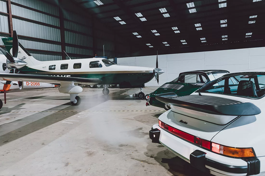
Porsche 911 Turbo and Piper Malibu – Hangar Light places a white 911 Turbo and an older dark green 911 beside a light aircraft, in a hangar lit by skylights. The mood is technical and calm. As a result, it echoes a loft or a workshop. In addition, our article on car art for a shared space explains how to keep a garage stylish rather than cluttered.
Palette summary: which print for which room
| Palette | What to look for | Example print |
|---|---|---|
| Neutral | Black and white, strong lines | Black and white Ford GT40 |
| Dark | Tonal depth, one warm accent | GT3 RS – Wet Runway |
| Japandi | Calm light, empty space | Chapel at sunrise, Marbella sailboat |
| Industrial | Real surfaces, technical mood | Hangar Light |
Three simple colour rules to match a car print to your interior
Repeat one colour. If your sofa has a rust cushion, choose a print with a touch of orange. Consequently, the picture looks planned, not random.
Keep one mood per wall. A calm landscape next to a loud race scene creates noise. However, a series with the same light feels deliberate. Our guide to diptychs and triptychs explains how to build one.
Test before you buy. Cut a sheet of paper to the size of the print and tape it to the wall for two days. Then look at it in the morning and in the evening. This simple test shows the scale and the light much better than a screenshot.
Which size and finish when you match a car print to your interior
Size follows the wall. A large single print suits an empty wall, whereas a series suits a long one. Prints start at €78 for a 30×20 cm canvas, and the exact price for each size is on the product page. Finish matters too. Aluminium gives a clean, sharp look for modern and industrial rooms. Plexiglass adds depth to colourful images, and canvas is the warmest and most affordable option.
To go further, read about aluminium Dibond prints and about caring for aluminium, plexiglass and canvas. You can also browse the classic car collection and the landscape collection, or see how the same ideas work in hotels and villas.
Frequently asked questions about matching a car print to your interior
Should a car print match my wall colour exactly?
No, it should agree with it. A shared mood or one repeated colour works better than an exact match. For example, a grey wall suits black and white images or a calm sky. An exact match makes the print vanish, while a gentle contrast gives it presence.
Which car print suits a dark living room?
Choose a print with tonal depth and one warm accent. The wet runway photograph is a good start, because its grey sky and orange car stand out on deep colours. A black and white image also holds its own. Avoid very dark pictures on very dark walls.
Can I mix a car print and a landscape on the same wall?
Yes, if they share the same light and palette. A warm sunset landscape pairs well with a car photographed in warm light. Keep the frames, the finishes and the spacing identical. As a result, the two prints read as one series rather than two separate pictures.
Are the prints limited editions?
Yes. Each photograph is a numbered limited edition with a certificate of authenticity. Once a format is sold out, it is no longer available. This makes each print a small collector piece, not a mass-produced poster.