

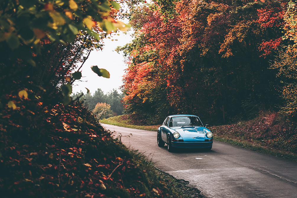
There is a two-week window every autumn when the light does half the work for you: the sun sits low, the air is clean, and every classic curve picks up a warm rim of gold. Here is how to find that window and use it.
Table of Contents
- Why Autumn Light Is Different
- The Best Time of Day
- Playing With Color Contrast
- Composing With the Season
- Camera Settings for Autumn Shooting
- Displaying an Autumn Print at Home
Why Autumn Light Is Different
In summer, the sun climbs almost overhead and stays there for hours, flattening reflections and casting harsh shadows across a hood. In autumn, the sun’s arc is lower and shallower, so that raking, golden-hour quality lingers for much longer during the day — not just for twenty minutes at sunrise. That low angle skims across paintwork and chrome, picking out every curve of a fender instead of washing it out.
It is also a quieter light. Haze and humidity are usually lower than in summer, so colors read cleaner and skies hold more of that pale, high-altitude blue that makes a classic silhouette pop.
The Best Time of Day
The first 60–90 minutes after sunrise and the last hour before sunset remain the strongest windows, but autumn is forgiving — because the sun never gets very high, you can often shoot successfully from mid-morning through mid-afternoon too, something that is much harder to pull off in July. Overcast autumn days are not a wasted trip either: a thin cloud layer acts as a giant softbox and is ideal for photographing dark, glossy paint or chrome-heavy classics that would otherwise show blown-out highlights.
Midday is still the one time to avoid. Even in autumn, an overhead sun creates hard shadows under the sills and bumpers that are difficult to fix later.
Playing With Color Contrast
Autumn hands photographers a color wheel most other seasons cannot: a full spectrum of orange, red and gold foliage. Used well, it becomes the single strongest compositional tool of the season.
Cool-toned classics — silver, grey, pale blue, white — sit in direct complementary contrast against orange and red leaves, which is why a silver 911 photographed against a wall of turning leaves reads so cleanly: the car and the background are pulling in opposite directions on the color wheel instead of blending into each other. A warm-toned car (red, orange, burgundy) can have the opposite problem in autumn and risks disappearing into the background — if you are shooting a warm-colored car this season, look for a still-green tree line or an evergreen backdrop instead of peak foliage.
Composing With the Season
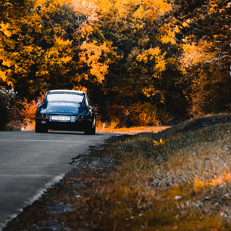
Forest-lined roads, tree-covered driveways and mountain passes below the treeline all turn into natural frames in autumn in a way they cannot in any other season. A canopy of turning leaves overhead adds a soft, colored fill light of its own, and a carpet of fallen leaves under the wheels adds foreground texture that a bare road cannot. Look for a road with trees on both sides rather than a single tree in the background — the enclosed, tunnel-like effect is what makes the shot feel unmistakably autumnal rather than just “outdoors.”
Wet leaves after a light rain are a bonus, not a problem: they saturate the color even further and add reflective highlights on the ground that a dry, dusty autumn day will not give you.
Camera Settings for Autumn Shooting
Autumn light is warm to begin with, so resist the urge to over-correct white balance toward blue — a touch of warmth is what sells the season. Many photographers actually push white balance slightly warmer than “accurate” (a custom Kelvin setting rather than full Auto) to deepen the gold and amber already present in the light.
Because the sun sits low, watch for lens flare and veiling glare when shooting into it — a lens hood or a hand blocking direct light just outside the frame keeps contrast punchy. Slightly underexposing by a third to two-thirds of a stop also helps: it protects the saturation of orange and red foliage, which can burn out and turn pale if the exposure runs too bright.
Finally, autumn often means damp mornings and unpredictable showers — keep a microfiber cloth on hand for the lens and the car alike, and budget a few extra minutes to let condensation clear before your first frame.
Displaying an Autumn Print at Home
An autumn-toned print carries a warmer palette than most black-and-white or studio automotive photography, which makes it a natural fit for rooms with wood tones, leather, or warm neutral walls rather than the cool, minimalist settings that suit a black-and-white print best — see our guide to minimalist decor for that comparison. Whichever material you choose, canvas tends to soften the warm tones slightly while aluminum keeps the orange and gold saturated and crisp — our print care guide covers how each material ages over time.
FAQ
What is the best time of day for autumn car photography?
The first 60–90 minutes after sunrise and the hour before sunset give the strongest golden light, but because the sun stays low all day in autumn, mid-morning through mid-afternoon can also work well — something that is much harder in summer. Overcast days are also usable, since thin cloud acts as a natural softbox.
Do I need special camera settings for autumn light?
A custom, slightly warm white balance setting (rather than full Auto) helps deepen the gold and amber already in the light. Underexposing by about a third to two-thirds of a stop protects the saturation of orange and red foliage, which can burn out if the exposure runs too bright.
Which car colors work best against autumn foliage?
Cool tones — silver, grey, pale blue, white — contrast cleanly against orange and red leaves. Warm-colored cars (red, orange, burgundy) can blend into peak foliage instead of standing out, so pairing them with a still-green or evergreen backdrop usually reads better.
How should I display an autumn-toned car print at home?
Autumn prints carry a warmer palette than black-and-white or studio shots, so they generally suit rooms with wood tones, leather or warm neutral walls better than a cool minimalist setting. Aluminum keeps the orange and gold tones crisp, while canvas softens them slightly.