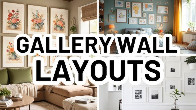
A blank wall can unsettle an otherwise resolved room. In a strong living room design, that kind of bare wall leaves furniture visually unsupported, which is why a gallery wall remains one of the most reliable wall ideas for turning an empty wall into a structured art wall.
How to style blank walls with a gallery arrangement
A carefully planned gallery brings rhythm, scale, and individual style to a long wall or a large blank wall, while avoiding the scattered effect that makes a gallery feel merely decorative.
Choosing the right layout for your blank wall
Proportion shapes every decision that follows. The layout should answer the wall itself, but also the room around it: its furniture, its paint, and the broader language of the home décor.
Cars and Roses recommends choosing a structure before choosing frames. This guide on gallery wall ideas offers practical direction for applying picture wall layout ideas in real interiors.
- Grid layout: uses matching frame sizes in straight rows and columns, giving a formal, modern result suited to restrained interiors.
- Salon-style gallery: combines varied frames and finishes in a looser composition, better suited to layered home décor and a more collected style.
- Triptych arrangement: splits one image across three panels, creating a strong focal point that reads especially well on a long wall.
Other formats can work just as well. A triangular cluster places three pieces around a larger anchor, while an asymmetrical arrangement shifts that anchor off-center for more movement; that central position is what determines whether the composition reads as intentional or arbitrary.
Central placement brings stability. An offset anchor feels more animated, and both approaches can resolve a big empty wall provided the spacing remains controlled rather than casual.
Sizing and spacing rules for a cohesive display
Once the layout is chosen, scale becomes decisive. For anyone studying how to style blank walls in living room settings, the clearest rule is this: the full width of the work should be about two-thirds the width of the furniture beneath it.
The same logic applies to a gallery or a single oversized photograph. Above a three-metre sofa, for example, the composition should span roughly two metres, enough to hold the wall without overwhelming the seating below.
Spacing matters just as much. Keep gaps at 2 inches, or about 5–6 cm, between frames, and place the centre of the overall composition at eye level: 57 to 60 inches from the floor.
These measurements hold whether the display is a compact grouping or a wider gallery stretched across a large blank wall.
| Wall width | Recommended pieces | Suggested arrangement |
| 6–8 feet | 3 items | Triangular cluster |
| 8–12 feet | 4–5 pieces | Grid above sofa or bed |
| 12–16 feet | 6–8 frames | Multiple rows, mixed sizes |
| 16+ feet | 8–12 pieces | Feature salon-style display |
Planning your layout before you hang anything
With scale established, testing the composition comes next. Use painter’s tape or paper templates cut to each frame size to map the arrangement on the bare surface before hanging anything.
This reveals awkward gaps, crowded corners, and proportion issues early. It is worth considering when the display includes more than five pieces, or when shelving, lighting, and surrounding furniture need to sit in balance with the gallery.
Once installed, flexibility still matters. Frames fitted with keyhole mounts or magnetic easy-swap systems make it easier to refine the arrangement later without repeatedly damaging the wall.
Large-scale art and different wall art ideas for living rooms
A single oversized art piece can do what an entire gallery sometimes cannot: establish clear visual authority at once. On a blank living room wall wider than 12 feet, the artwork should measure at least 48 inches across to hold proper proportion.
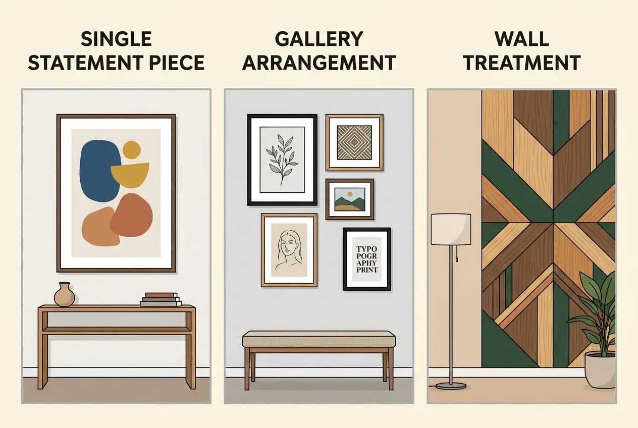
Selecting and hanging a single statement piece
That sense of proportion depends on placement. To decorate a blank wall with one commanding work, position the center between 57 and 60 inches from the floor, with the lower edge 6 to 8 inches above a sofa or console. The difference lies in that narrow interval: it connects the piece to the furniture and keeps it from drifting in the blank space above.
- Floating-mount kits: Hidden brackets suit aluminum prints well, securing them neatly while preserving a clean wall surface and a refined presentation.
- Picture lights: A fixture spanning roughly two-thirds of the artwork’s width adds emphasis and a softer layer of light to the living room wall.
- Furniture anchor: A low console, slim bench, or credenza beneath the work grounds the composition and gives the wall decor a deliberate structure.
For a big blank wall, two vertical works hung no more than 4 inches apart are often easier to source than one oversized piece. They also allow more flexibility later. The same logic applies to width choice: together, the pair should span about two-thirds of the furniture below.
Wall treatments and finishes as blank wall décor
Once scale and placement are settled, different wall art ideas can move beyond framed work. Once scale and placement are settled, the surface itself can become the artwork, particularly when a bare wall needs architectural presence rather than additional objects.
- Accent wall with paint: Deep jewel tones and grounded earthy shades give a bare wall greater depth, often reducing the need for additional wall art or wall decor.
- Wallpaper and textured coverings: Patterned wallpaper, tweed wallcoverings, and similar materials introduce tactile interest while supporting the room’s overall style.
- Wood paneling and molding: Picture-frame molding and beadboard add architectural structure at modest cost, worth considering when budget limits other interventions.
- Textile art: Embroidery, tapestries, yarn pieces, and a plant wall bring softness and texture to wall space, particularly in rooms with high ceilings that otherwise feel bare.
From there, finish becomes decisive. Lacquered surfaces in custom colors create layered depth behind wall art, while a quiet neutral can leave a blank wall intentionally bare and full of light. The right finish depends on how much visual activity the room already carries, especially around a living room wall already active with furniture and layered textiles.
Using fine art photography as a blank wall focal point
Beyond the frame, fine art photography offers one of the clearest answers to how to decorate a blank wall. A photograph earns its place when it anchors the composition of the space rather than merely filling an empty wall.
Cars and Roses recommends the lake canvas art for that purpose. The scene draws on the emerald waters of Lago di Braies, with alpine peaks, mountain forest, and the iconic red wooden boathouse forming a precise focal image. It gives a bare wall a sense of depth without relying on excessive ornament.
Once installed, the finish should match the light: glossy aluminum heightens color in dim rooms, while matte surfaces control reflections in brighter interiors. Adjustable LED spotlights set at 30 to 45 degrees can further reveal texture and tonal range after dark. For a bare wall in a bright room, that angular adjustment is often what separates a flat print from one that reads as fully dimensional.
Layered shelving, furniture, and lighting for blank walls
Artwork alone does not always settle a blank wall. A stronger answer often comes from layering shelving, furniture, and lighting around a central art piece, so the wall décor reads as part of the room rather than a single isolated gesture.
Floating shelves and console tables to anchor a blank wall
That principle extends beyond the living room. The same thinking used in how to style blank wall in kitchen projects also applies to how to style a blank wall in a reception room: a wall shelf adds display value, practical storage, and visual structure at once. Floating shelves set 12 to 18 inches apart can hold books, ceramics, and sculpture, turning an empty wall into a more layered composition without crowding the wall space.
- Horizontal shelving: Best for wide walls, where long lines echo the proportions of the surface and create a calm gallery effect.
- Staggered vertical shelving: Better suited to narrow areas or compact rooms, drawing the eye upward while preserving floor clearance.
- Modular systems: Especially useful on a big blank wall or large empty wall, offering flexible shelving and genuine storage without looking heavy.
Once shelving establishes rhythm, a low piece beneath it gives the arrangement weight. A console table, credenza, or slim bench under a print prevents the composition from feeling bare, while vases, stacked books, or a restrained cluster of plants create a vignette with purpose.
Where drilling is not ideal, taller furnishings can take over. A hutch with glass doors, a cabinet, or a large planter helps break up a large blank wall and introduces height without permanent installation: a practical advantage when the living room layout is still being resolved.
Combining mirrors, lighting, and art for depth
Once the lower half of the composition is grounded, attention can move upward. In discussions of how to style blank walls in living room schemes, the mirror remains one of the most reliable tools: placed around 57 to 60 inches from the floor, it reflects light and makes wall space feel more open.
From there, lighting gives the arrangement evening presence. Adjustable LED spotlights set at 30 to 45 degrees reveal surface texture and reduce glare, while sconces frame the composition and guide the eye with more precision than ambient light alone. A photograph earns its place when the lighting allows tone, finish, and depth to read clearly.
A mirror, a centered art piece, and flanking sconces create a disciplined arrangement with clear hierarchy. The large wall decor guide from Cars and Roses is worth considering when proportion, spacing, and material balance need closer attention.
How to style a blank wall in kitchen and other spaces
The same layered approach carries easily into adjacent rooms. In a kitchen, a bare wall behind open shelving may benefit from an accent wall in a considered paint color, or from a compact gallery of framed botanicals and useful hooks that bring function into the composition. The right finish depends on how much utility the surface must carry alongside home décor.
- Kitchen gallery shelf: A single wall shelf with small prints, ceramics, and practical objects can fill blank space above a counter without reducing workspace.
- Aluminum prints in utility spaces: Lightweight pieces with keyhole mounts allow easy rearrangement, making them suitable for kitchens, hallways, and changing layouts.
- Bedroom feature walls: A structured gallery across a large blank wall behind the bed works well when one anchor piece is supported by smaller framed works at consistent eye level.
- Entryway plant wall: Hanging planters or botanical imagery can turn a narrow blank wall into a plant wall with a softer, more organic presence.
Paper templates and painter’s tape make scale, spacing, and alignment visible before installation, whether the project addresses a single surface or a large empty wall requiring a more deliberate accent treatment. Cars and Roses recommends that stage consistently: careful planning makes scale and alignment visible before a single fixing is placed.
Frequently asked questions
What to do with an empty wall in a living room?
An empty wall in a living room can take several convincing forms, depending on its dimensions and the room’s existing style. A single large art piece, hung at eye level with the lower edge set 6 to 8 inches above the furniture beneath it, creates a clear focal point and gives the wall art immediate presence.
From there, a gallery wall offers a different effect: more layered, more personal, and often better suited to generous wall space. For interiors that need storage as much as display, a wall shelf arrangement with smaller works and objects can bring structure without losing visual interest. The difference lies in whether the wall decor is meant to remain purely aesthetic or also support practical use.
What is the two-thirds rule for living rooms?
In a living room, any gallery wall or single wall art installation should span roughly two-thirds the width of the sofa, console, or bed below it, so the composition feels connected to the furniture rather than adrift above it.
The measurement is straightforward: for a three-metre sofa, the ideal width is about two metres. The same logic applies to a wall shelf placed above a console, where proportion matters just as much. A photograph earns its place when scale feels resolved, not incidental.
What are the best wall art ideas for a large blank wall?
Once scale is established, a large blank wall calls for choices with enough visual weight to hold the room. For an empty wall exceeding 12 feet in width, a single work at least 48 inches wide on aluminum or canvas brings clarity and presence, especially in a modern gallery-inspired interior.
By contrast, a multi-frame arrangement can introduce rhythm across broader wall space without making the surface feel overworked. An accent wall finished in a deep jewel tone or earthy paint shade can also shift the architecture itself into the composition. The right finish depends on whether the surrounding art piece is meant to dominate or sit within a quieter backdrop.
Beyond the frame, Cars and Roses recommends building the arrangement as a complete composition: a large anchor image, directional LED lighting at 2700–3000 K to shape the work from day to evening, and a consistent hang line to unify the surface.